Welcome to Onco Pro Exp
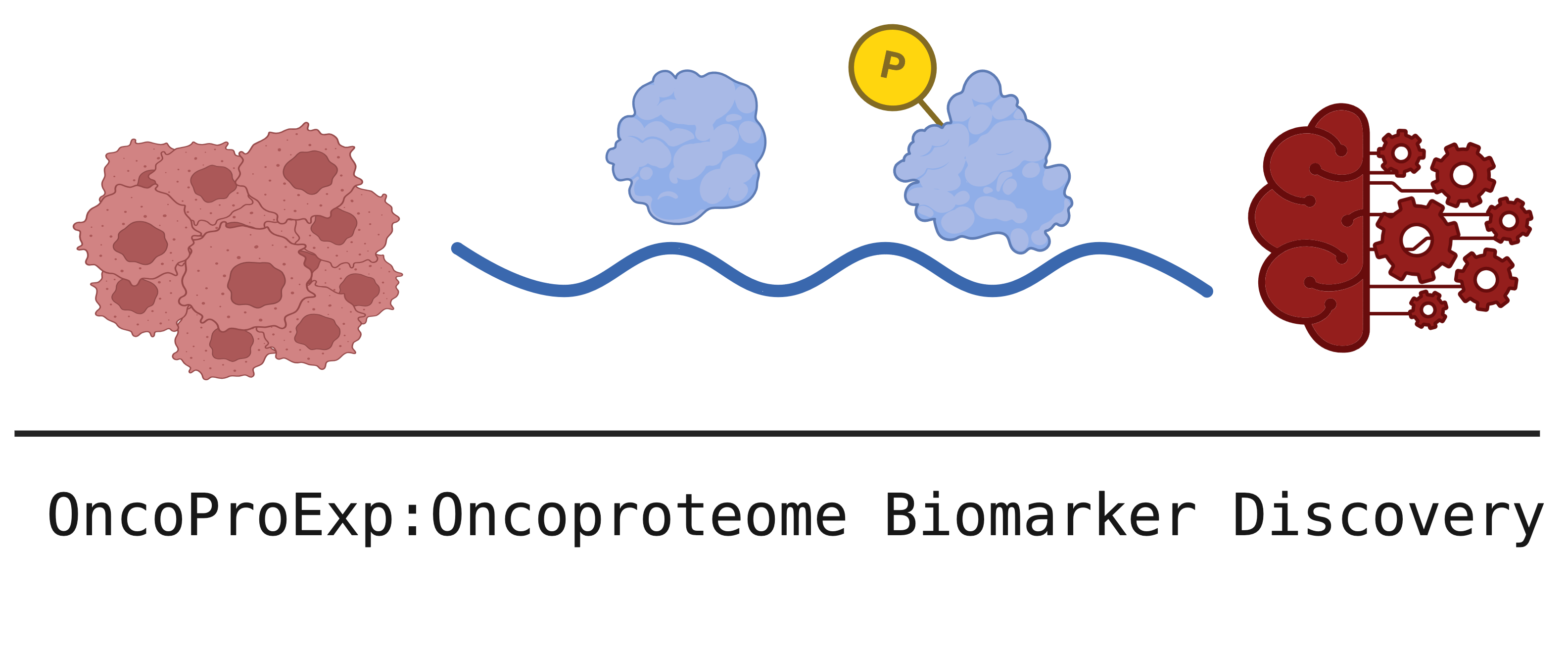
OncoProExp: An Interactive Platform for Cancer Proteomics and Phosphoproteomics Analysis
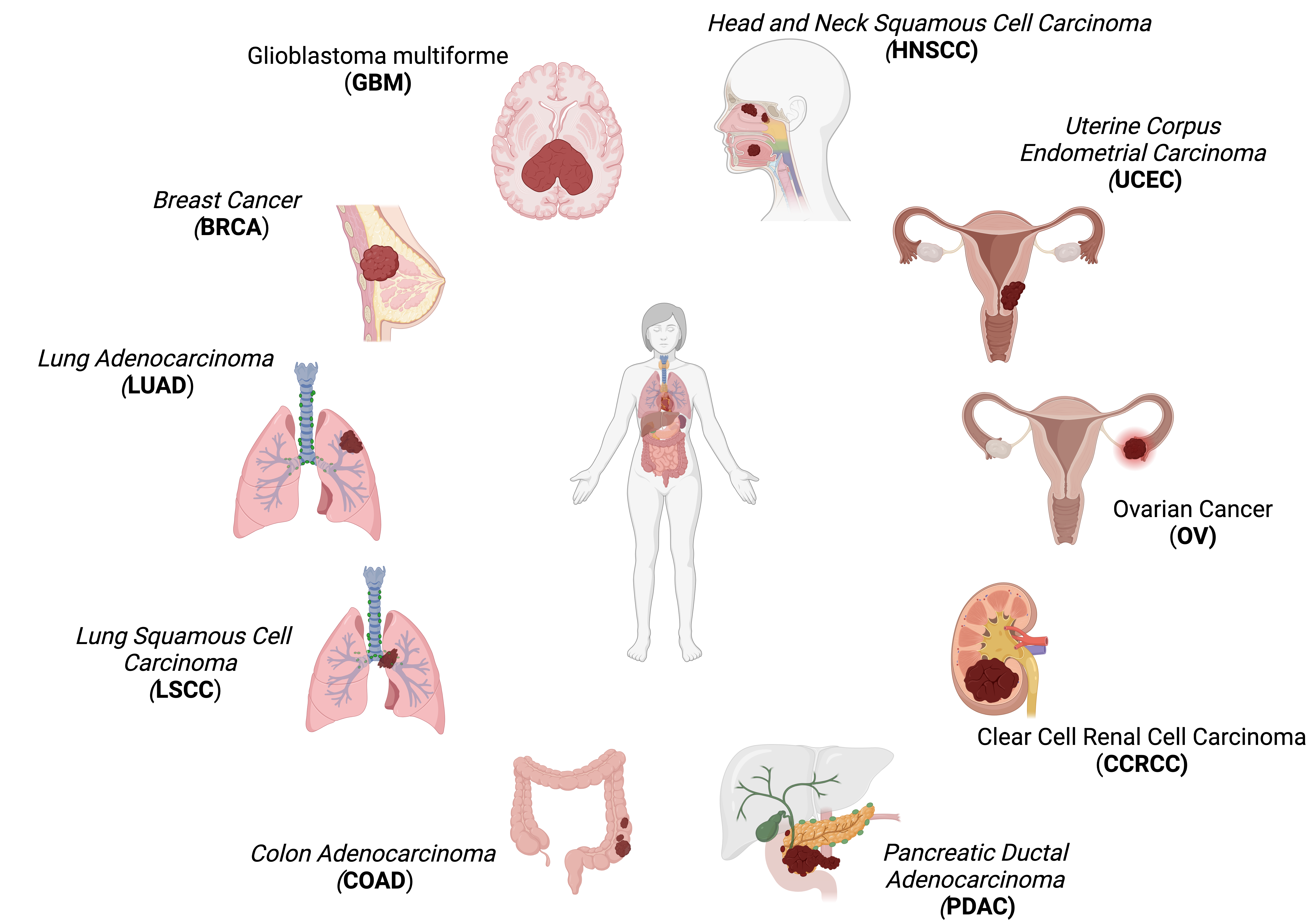
OncoProExp is comprehensive web-based Shiny application designed for visualization, statistical analysis, and predictive modeling of cancer proteomics and phosphoproteomics data. This platform allows for in-depth exploration and prediction of tumor versus normal samples across multiple cancer types. OncoProExp utlizes data from Clinical Proteomic Tumor Analysis Consortium (CPTAC) and includes the following Proteome and Phoso-proteome types
The number of patients, average age, % female and number of tumor and normal samples are shown in the table below.
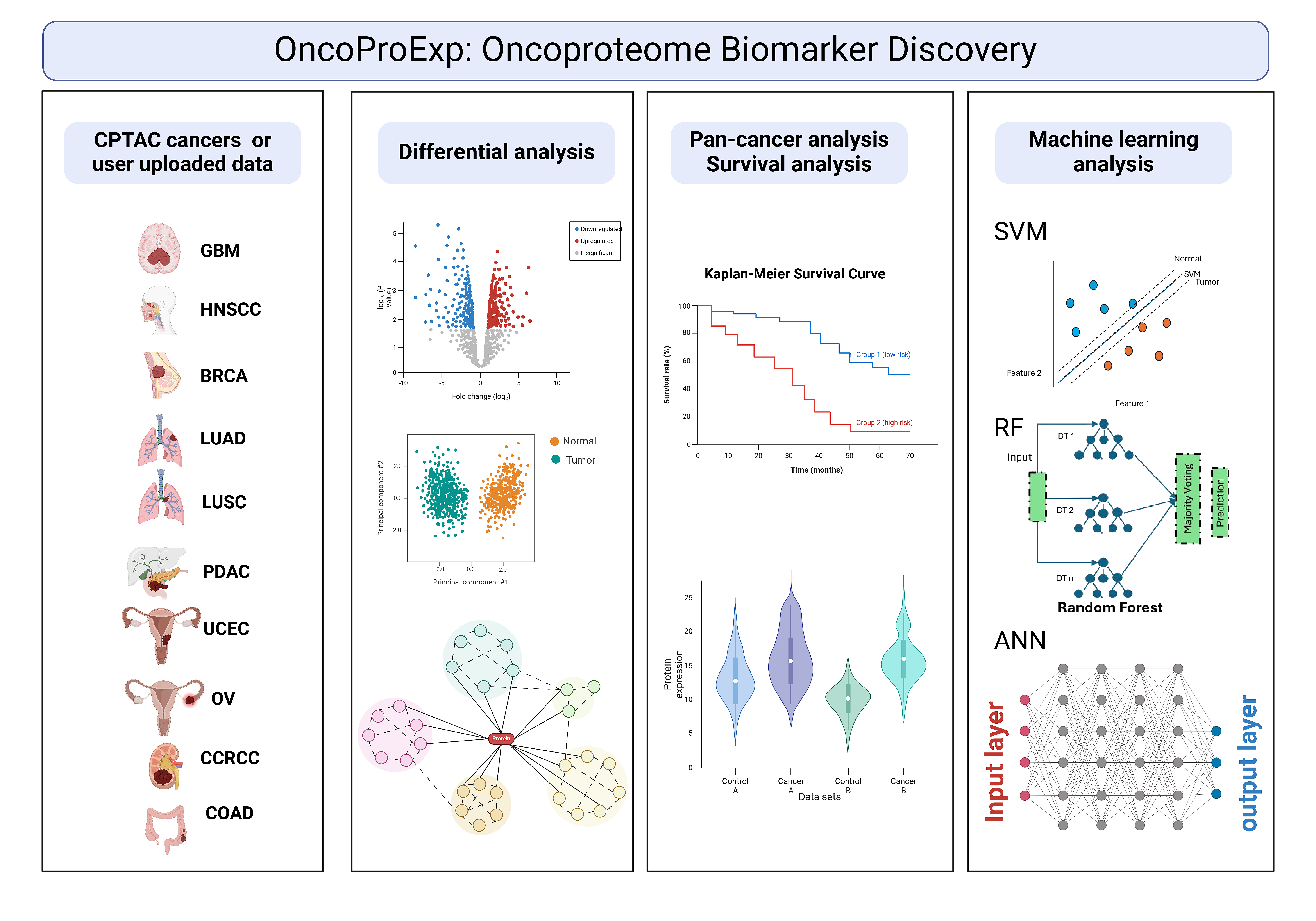
The main functionalities presented in the webtool, and their summary is described below.
1. Data Preprocessing: Imputation, normalization, outlier management, and distribution checks to ensure robust data quality.
2. Data Visualization: PCA, MDS, UMAP, heatmaps, and density plots to visualize protein and phosphoprotein distributions.
3. Gene Set Enrichment Analysis (GSEA): Analysis of pathways and biological processes relevant to cancer progression, like the Kras signaling pathway.
4. Differential Expression Analysis: Identification of differentially expressed proteins and phosphoproteins, revealing metabolic and molecular profiles specific to each cancer type.
5. Survival Analysis: Kaplan-Meier plots and Cox proportional hazard models to assess protein and phosphoprotein markers associated with patient survival outcomes across cancer types.
6. Protein-Protein Interactions and Protein-Drug Interactions: Visual exploration of protein networks, including potential drug targets, available in the Differential Expression tab.
7. AI-based Predictive Models: Predict cancer types with SVM, Random Forest, and ANN models tailored to handle complex proteomic and phosphoproteomic datasets.
If you find our tool useful, please cite our paper:
This tool is free of charge and is intended solely for non-commercial, academic, and research purposes. It should not be used for any commercial applications or profit-driven activities. Our mission is to support researchers, students, and professionals in advancing knowledge, and we kindly request that users respect these terms to help maintain the accessibility and integrity of the tool.
Data Privacy and Security:
- We use session cookies to maintain active sessions and optimize tool performance.
- No Personal Data Storage: We do not store any personal information, cookies, or uploaded files. All uploaded files are renamed with random identifiers for added security and are deleted immediately after processing.
- Anonymized Location Data: For general analytics and to improve user experience, we may use IP addresses to approximate your location (city, state, or country). This information is anonymized, used only for traffic pattern analysis, and is not linked to any specific user.
- Opt-out Option: You can disable location services in your browser settings if you prefer not to share approximate location data.
- Transparent Processing: All data handling is transparent, secure, and strict to provide a better user experience without compromising your privacy.
- Technical Limitations: The web platform has a maximum upload limit of 50 MB and utilizes 5 processing cores, which may result in longer processing times for larger datasets (typically 5–10 minutes for datasets near the limit, depending on complexity). For extremely large or resource-intensive analyses, we recommend installing OncoproExp locally using the Docker setup detailed in the README.md (accessible via the our GitLab repository), where users can adjust resources to accommodate larger data volumes.
Data preprocessing
Data preprocessing is the first crucial step in preparing the raw data and making it suitable for a machine learning model. Finding missing values, detecting outliers, and batch effect correction are essential steps before performing any analysis. Some algorithms require data to meet some assumptions, such as following a normal distribution. Data transformation (e.g., log, z-score, scaling, etc.) can prevent model bias and reduce computation time. OncoProExp uses missForest and dlookr packages to impute missing values, diagnose, explore, and transform data. For batch effect correction, OncoProExp supports ComBat from SVA package, enabling robust adjustment of unwanted variation. Please upload your data with samples organized in columns and features in rows or Load CPTAC data.
Check the separation field, file format, or load the example.
Head of table
General overview
Outlier detection
Missing values
Outlier distribution
Head of imputed values
Head of imputed Outilers
Head of batch effect correction
Visualization
Differential Expressed Proteins and Phosphoproteins
OncoProExp uses Median Absolute Deviation (MAD) to identify variable features. PCA plots, box plots, density plots, and heatmaps visualize feature variability, while Multidimensional Scaling (MDS) reveals sample clustering. Differentially expressed proteins (DEPs) and phosphoproteins (DEPPs) are determined using empirical Bayesian modeling through `lmFit` from the limma package, with results visualized via volcano plots and heatmaps using ComplexHeatmap package. Enrichment analysis, facilitated by gprofiler2 , identifies enriched pathways, with summarized bar plots and Plotly visualizations. Protein-Protein Interaction (PPI) analysis identifies key proteins using network visualizations, helping to explore biological interactions ( STRINGdb ). Drug relevance is explored by linking DEPs with drugs using DrugBank and Cancer Drugs Database , identifying potential therapeutic interventions.
Users can upload their protein/phosphoprotein expression dataset (with gene symbols/IDs in the first column and sample data in remaining columns) and metadata (with sample names and class labels in the first two columns).
Check the separation field and file format in your expression and metadata files, or load the example.
Expression table and metadata
Table
Inspecting DEPs/DEPPs
Explore differentially expressed proteins in the DrugBank website to gain insights into therapeutic potential and identify relevant drugs.
CancerDrugs_DB is a curated database created by the Anticancer Fund, offering an accessible listing of licensed cancer drugs from sources such as the NCI, FDA, and EMA. This resource supports researchers, clinicians, and regulatory bodies with a comprehensive catalog of drugs approved specifically for cancer treatment, excluding supportive care, diagnostic agents, and investigational treatments. By leveraging CancerDrugs_DB, we aim to identify matching protein targets between licensed cancer drugs and our own differentially expressed proteins, enabling deeper insights into potential therapeutic connections.
Box plot and differentially expressed proteins (DEPs) and phosphoproteins (DEPPs) Across Cancer Types
This section provides tools for analyzing protein and phosphoprotein expression patterns across multiple cancer types. Users can visualize standardized protein or phosphoprotein expression levels via Boxplots that differentiate between Tumor and Normal samples, enabling the identification of key expression trends across selected cancer types. In addition, the DEPs/DEPPs offers detailed metrics such as fold change and p-values for statistically significant proteins or phosphoproteins, supporting deeper insights into expression differences. By integrating fast data processing tools like fst and data.table , this dual approach facilitates dynamic, efficient, and comprehensive pan-cancer analysis for biomarker discovery and research.
AI-based Predictive Models
In OncoProExp , predicting cancer types from proteomic and phosphoproteomic data is accomplished using advanced AI-based models including Support Vector Machines (SVM) from e1071 , Random Forests (RF) from randomForest , and Artificial Neural Networks (ANN) from keras with TensorFlow v2.10 in the backend. Model performance is evaluated using metrics such as accuracy, sensitivity, specificity, precision, F1-score, and AUC; users should upload their table with gene/IDs in the first column and sample data in the remaining columns. Additionally, if desired, users can enable permutation testing by checking the designated box, which trains a separate model with 10 permutations—shuffling the labels 10 times and averaging performance—to assess model reliability (this will slow down model building). Finally, to test the performance of models based on predicted labels, users need to upload a CSV file with two columns: one for sample names (exactly matching those used for prediction) and another for labels formatted as 'Tumor' or 'Normal' followed by the cancer type (e.g., Tumor.HNSCC or Normal.COAD).
Check the separation field, file format, or load the example.
Uploaded table
Model
Model Performance
New Data Prediction
Permutation Test Results
Real labels for comarison (if any)
Survival Analysis
The survival analysis section in OncoProExp provides comprehensive survival modeling tools to explore prognostic markers using survival package. Kaplan-Meier plots are generated based on user-defined protein/phosphoprotein expression thresholds, enabling visual assessment of survival outcomes for specific biomarkers.Cox proportional hazards models are used for each split criterion, specifically the median, enabling robust hazard ratio (HR) estimation and testing of covariate effects on survival. A unique feature in this module allows users to adjust covariates while calculating hazard ratios, making the models flexible for multi-variable analysis. Each gene’s best split point is automatically identified, based on the optimal HR, to ensure balanced group comparisons.
Select a cancer type to download the expression and metadata files for both proteome and phosphoproteome data.
You can access all the codes and data on our GitLab page: OncoProExp
OncoProExp Tutorial Page
Welcome to the OncoProExp Tutorial Page! This guide will assist you in navigating and utilizing the features of OncoProExp, a powerful web-based platform for cancer proteomics and phosphoproteomics exploration and analysis. Below, you’ll find detailed instructions and FAQs to help you get started and maximize the potential of the tool. For a complete walkthrough of each section, explore our comprehensive video tutorials available at this YouTube playlist.
Getting Started
Accessing OncoProExp
- Ensure your browser is updated for optimal performance (recommended: Google Chrome, Safari, or Mozilla Firefox).
System Requirements
- A stable Internet connection.
- Latest versions of Google Chrome, Mozilla Firefox, or Microsoft Edge.
For further help in individual modules, click on the respective tabs for more details.
Frequently Asked Questions (FAQs)
- Q1. What types of datasets can I upload?
You can upload proteomics or phosphoproteomics datasets in CSV or TSV formats. Ensure the data follows the required structure outlined in Section 4. - Q2. How do I handle missing values in my dataset?
OncoProExp automatically filters features with excessive missing values during preprocessing. You can adjust the threshold in the “Upload Data” tab. - Q3. What machine learning models are available?
The platform uses Random Forest, Support Vector Machines, and Artificial Neural Network for predictive modeling. You can apply them to classify tumor vs. normal samples or train new models. - Q4. Can I compare my data with CPTAC datasets?
Yes! CPTAC data is integrated into the platform, and you can perform comparative analyses with your uploaded data. - Q5. How do I export results?
All plots and results can be downloaded in PDF format by clicking the “Save plot” button and tables by “Save Table” button.
Troubleshooting
- Issue: Data upload fails.
Ensure the file is in CSV or TSV formats and follows the required structure. Check for invalid characters or missing values exceeding thresholds. - Issue: Visualization tools not working.
Refresh the browser. Verify that your dataset has been processed successfully.
Contact Us
For technical support or feedback, contact us at:
Introduction
The Preprocessing tab is designed to help users clean and prepare their expression data before analysis. Proper preprocessing is crucial for ensuring data quality and for meaningful downstream analyses. This tutorial will walk you through the steps to upload your data, diagnose issues, impute missing values, manage outliers, and visualize the distribution of your data.
1. Sidebar Panel: Uploading and Configuring Data
The Sidebar Panel allows you to upload your expression dataset and configure options for data preprocessing. Here is a step-by-step breakdown:
- Expression Table Upload:
Upload your expression data using the
Expression tableinput. The first column should contain protein names, while the other columns should represent expression values for individual samples. Supported file formats are.csvand.tsv. You can also choose the example dataset if you want to explore preprocessing features without uploading your own data (Load CPTAC data). Then click the process botton to start the analysis. - File Format Selection:
Select the correct file format using the
Formatdropdown. This helps the system interpret the uploaded data correctly, preserving the original rows and columns.
2. Main Panel: Overview and Diagnostics
The Main Panel provides different tools to review data quality, diagnose missing values, detect outliers, and visualize data distributions:
- Data Table View:
The
Data Preprocessingtab provides a preview of your dataset. Only the first few rows are displayed to provide an overview of the loaded data. This helps ensure that the data structure is correct before proceeding with the analysis. - Data Diagnostics:
The
Data Statisticssection allows you to assess your dataset for various quality indicators:- General Overview: A full diagnostic summary of the dataset, including feature types, value ranges, and distributions.
- Numeric Overview: View specific metrics for numeric features, such as minimum, maximum, and median values.
- Categorical Overview: Details about categorical features, such as levels and their counts.
- Missing Values: Identify the number of missing values in each feature and their proportion in the dataset. Missing values can lead to biased results and must be handled carefully.
- Outlier Detection:
Outliers can skew the results of downstream analyses, so it is important to identify and address them during preprocessing. Use the
Outlier Detectiontab to identify variables that contain outliers and take necessary actions based on the provided diagnostics. - Outlier Plotting:
The
Outlier Plottingsection allows you to visualize the outliers for selected numeric variables. Visual inspection helps determine if the chosen imputation strategy is suitable.


3. Data Transformation and Outlier Handling
After diagnosing missing values and outliers, the next step is to impute them where necessary.
In the Missing Values tab, users can choose how to handle missing values in the dataset:
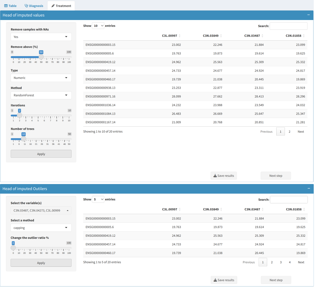
- Imputation: Options include statistical methods (e.g., mean or median) or more sophisticated algorithms like RandomForest imputation.
- Removing Rows/Columns: Remove entire rows or columns if a high proportion of values are missing, ensuring the dataset retains its quality and robustness.
- Outlier Imputation:
Use imputation methods to replace outliers with less extreme values to minimize their influence. The options include replacing outliers with the median, mean, or using more complex approaches such as capping.
4. Batch Effect Correction
This section provides options to handle unwanted variation introduced by non-biological factors.
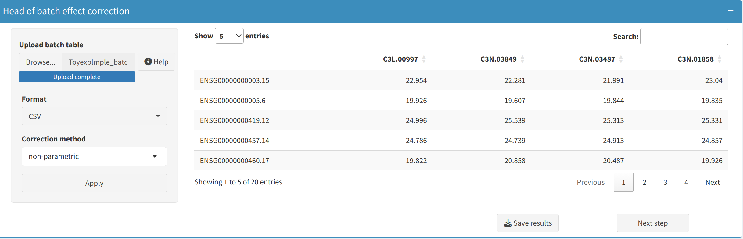
- ComBat Adjustment:
Apply the ComBat algorithm to correct batch effects using either parametric or non-parametric empirical Bayes frameworks. Suitable for both small and large datasets with known batch labels.
When to use:
- Parametric adjustment is recommended when the data approximately follows a normal distribution and batch sizes are reasonably balanced. It is faster and generally effective for most typical datasets.
- Non-parametric adjustment should be used when the normality assumption does not hold or when dealing with small, imbalanced batch sizes. It is more robust but computationally intensive.
5. Data Visualization: Understanding Data Distributions
To understand the structure of your data, it is important to visualize it. The Data Distribution Visualization tab provides options to generate visual representations of your dataset:
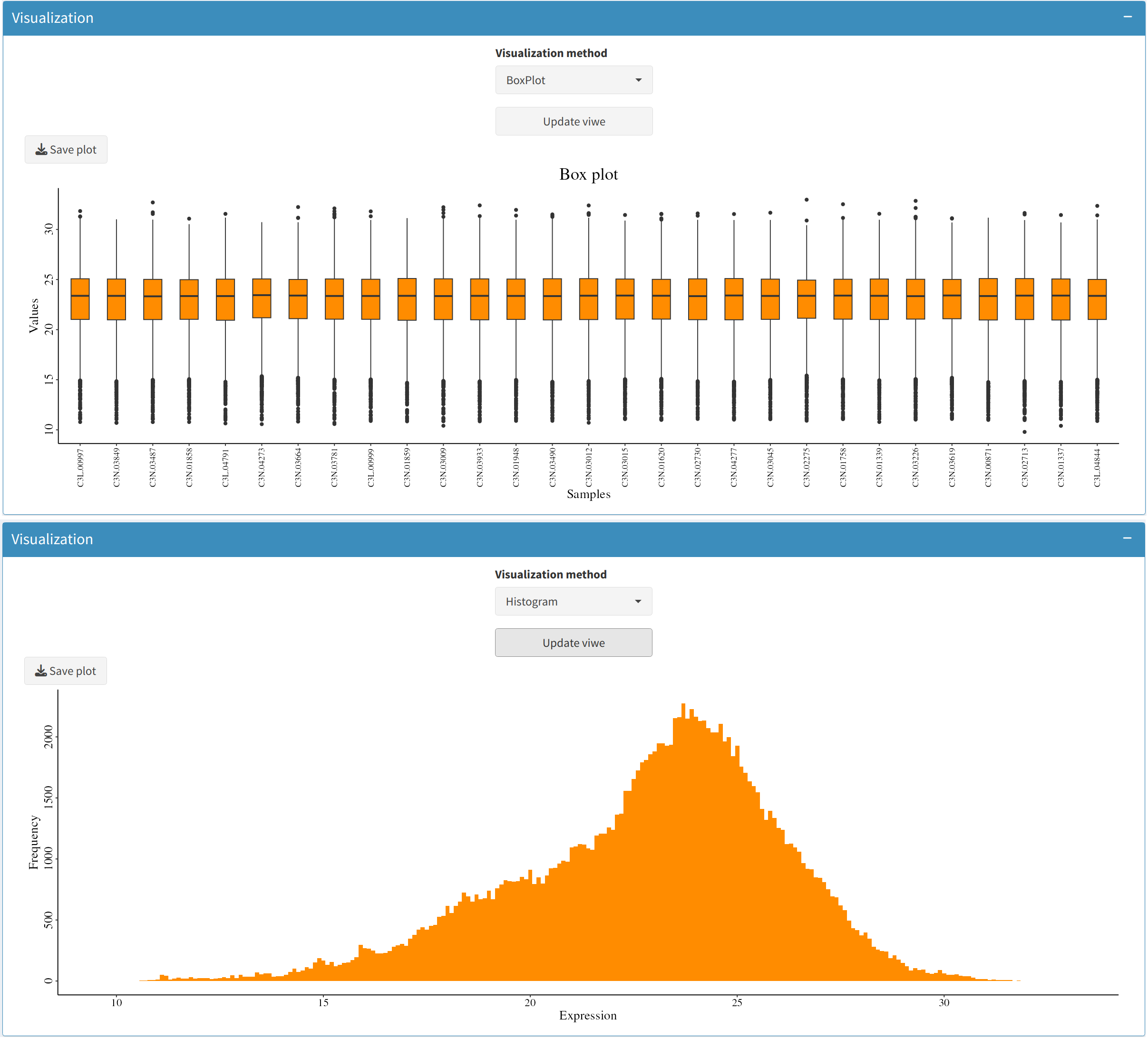
- Box Plot:
Generate box plots to view the spread of expression levels across different features. This is useful for identifying potential data inconsistencies and determining the presence of outliers.
- Histogram:
Histograms help to observe the distribution of expression values, providing insights into whether the data is skewed or normally distributed.
6. Completing Preprocessing
Once you have handled missing values, addressed outliers, and explored the data distributions:
- Download Preprocessed Data: You can download the cleaned dataset for further analysis. Use the provided
Downloadbuttons to save the imputed and transformed datasets. - Proceed to Analysis: Use the preprocessed data for subsequent analyses, such as differential analysis or machine learning-based predictions. Clean data ensures reliable and meaningful insights.
Introduction
The Differential Analysis tab provides users with the ability to analyze differences in protein expression between two experimental conditions. This analysis is crucial for identifying biomarkers or understanding biological pathways that are significantly affected. Below is a comprehensive guide to using the tab effectively, including data uploading, setting parameters, and visualizing the results interactively.
1. Sidebar Panel: Uploading and Configuring Data
The Sidebar Panel contains various controls for uploading expression data and metadata, configuring preprocessing options, and starting the analysis. Here's a detailed breakdown of each control:
- Expression Data Upload:
Use the
Expression tableinput to upload your expression dataset. This file should have gene/protein identifiers in the first column, with expression values in the remaining columns. Accepted formats include.csvand.tsv. - Metadata Upload:
The
Metadatainput is used to upload sample information, such as experimental conditions. Metadata should include columns like sample identifiers and group labels (e.g., control vs. treatment). Proper metadata is crucial for accurate differential analysis. - Format Selection:
Select the appropriate file format (CSV or TSV) using the
Formatdropdown to ensure that your data is properly interpreted by the system. - Load CPTAC data:
If you want to explore the features without uploading your own data, use the
Load CPTAC databutton. You can specify the type of data (e.g., Proteome or Phosphoproteome) and the cancer type (e.g., Lung Adenocarcinoma). This is helpful for understanding the workflow. - Gene Filtering:
Choose a filtering method to refine your dataset before running the differential analysis:
- Variance: Retains features with high variability across samples, as they are likely to be biologically significant.
- minExpression: Filters out proteins or phosphoproteins that are not expressed above a minimum level in a certain proportion of samples.
- None: No filtering is applied, and all features are retained.
- Cutoff Parameters:
Adjust the thresholds for filtering using the provided sliders:
- Variance Cutoff: Set the minimum variance level to retain highly variable features.
- Minimum Expression: Set the minimum expression level and the proportion of samples required for a gene/protein to be retained.
- Conversion Options:
Use the
Ensembl to symboloption to convert Ensembl IDs to gene symbols for easier interpretation. - Preprocess Button:
After configuring all the settings, click the
Processbutton to apply filtering, normalization, and other preprocessing steps to your data.

2. Visualization Tools and Sample Analysis
Once data preprocessing is complete, you can use various visualization tools to explore the dataset:
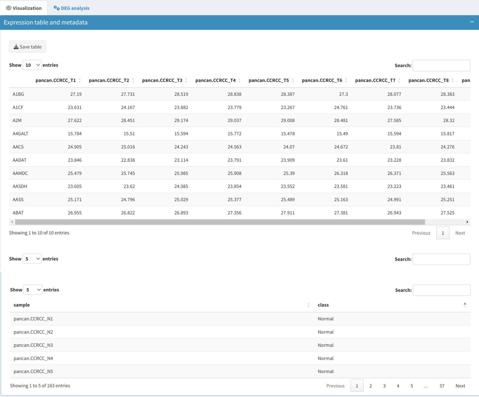
- Expression Table: Displays the preprocessed expression data in a dynamic table, including gene/protein names and their corresponding expression values across all samples.
- Metadata Table: Shows information about the samples, such as experimental conditions and other relevant attributes, which are crucial for grouping and further analysis.
Use the Median Absolute Deviation (MAD) method to identify the most variable genes in the dataset, helping to focus on features that exhibit the highest degree of variability across samples, which are often the most informative for further analysis.
Analyze feature variability using the following visual tools. If users select each sample in the metadata table, they can benefit from using labeling in the following visualization methods (except for GSEA):
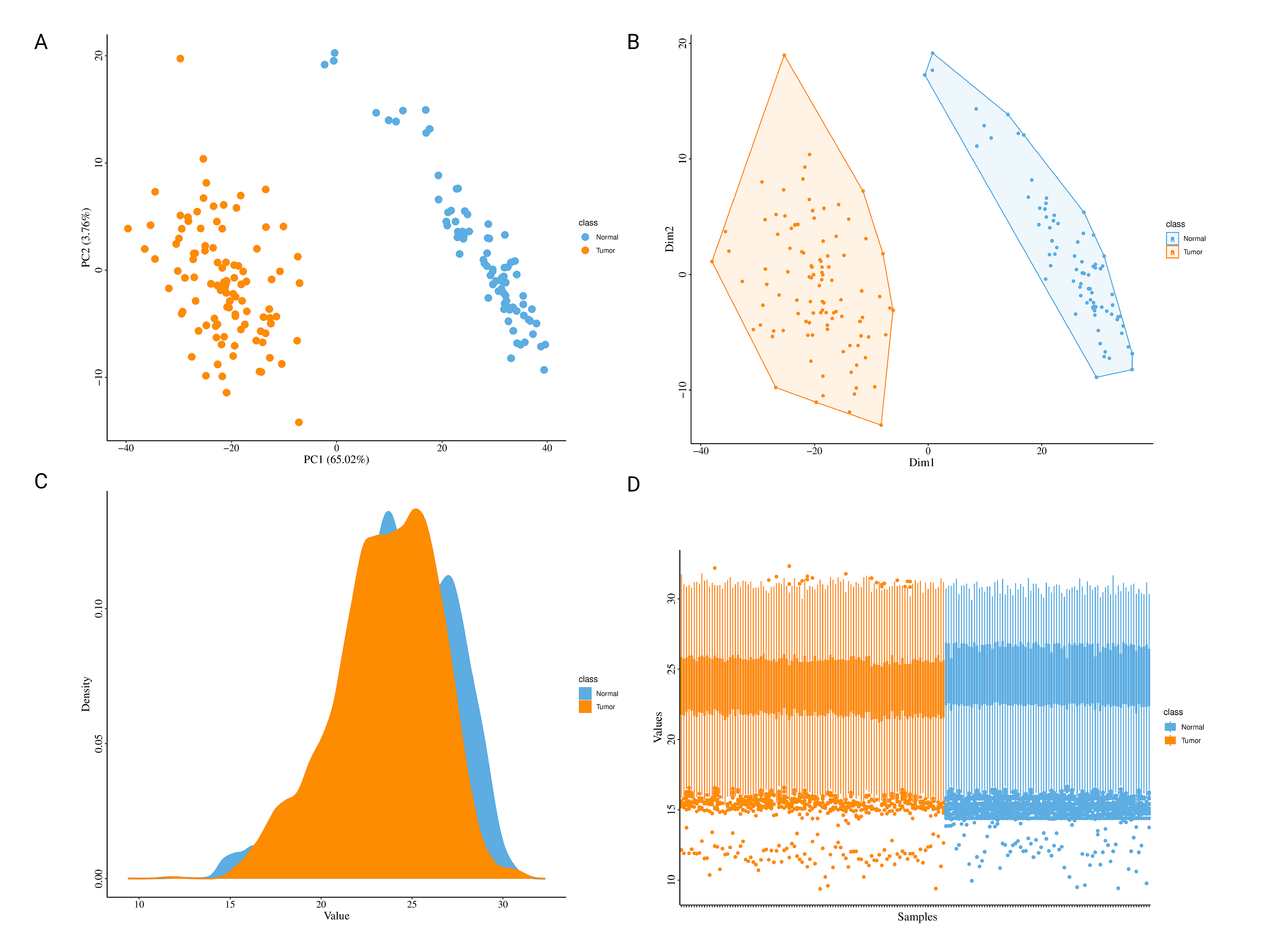
- PCA Plot: Visualize sample clusters, adjusting the number of components and selecting labels or scaling as needed.
- UMAP and MDS: Reduce data to two dimensions to easily spot patterns among samples.
- Heatmap: Visualize hierarchical clustering of features and samples. Options are provided for clustering and displaying feature names.
- Density Plot: View the distribution of expression values across samples to identify anomalies or trends.
- Boxplot: Assess expression distributions across experimental conditions, useful for understanding condition-specific effects.
- Gene Set Enrichment Analysis (GSEA): Identify and visualize enriched biological pathways through bar plots, providing insights into the functional consequences of each PCA's components.


4. Differential Expression Analysis and Functional Exploration
Use additional analyses to understand the biological significance of differentially expressed proteins:
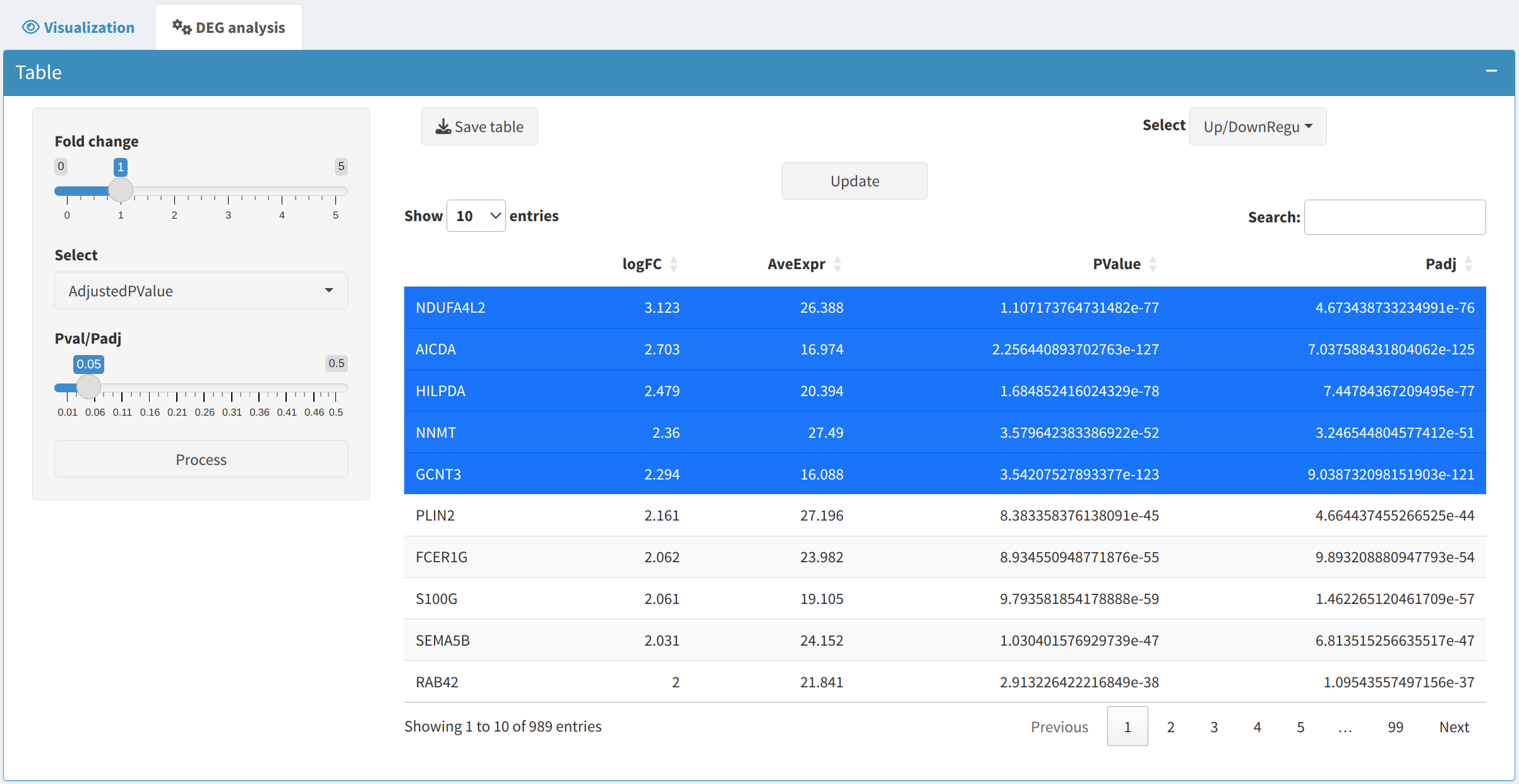
- DEP/DEPP:
After setting fold change and p-value thresholds, click
Processto generate a table of differentially expressed proteins (DEPs) and phosphoproteins (DEPPs). The table includes statistical measures and categorizes genes into upregulated or downregulated groups. - Inspecting DEPs/DEPPs:
Users can visualize selected proteins or phosphoprotein of interest (e.g., the top 5 up- and down-regulated ones by sorting the logFC column of the DEP/DEPP) on the following plots:
- Heatmap: Shows the clustering patterns of DEPs and DEPPs, allowing users to observe their expression profiles across samples.
- Boxplot: Visualizes the expression distribution of selected DEPs/DEPPs across different conditions, helping to understand their variability and impact.
- Volcano Plot: Displays DEPs/DEPPs symbols, highlighting upregulated and downregulated ones based on fold-change and p-value thresholds.
- SDRankMean Plot: Illustrates the relationship between standard deviation and rank mean, helping to identify outliers and consistency in expression patterns.
- Functional Analysis:
- Enrichment Analysis: Identifies biological terms or pathways linked to DEPs/DEPPs, highlighting key processes impacted by experimental conditions.
- KEGG Pathway Exploration: Use KEGG pathways to visualize relationships between DEPs/DEPPs, offering insights into biological functions.
- Protein-Protein Interaction (PPI): Investigate interactions between proteins using networks from public databases to identify key regulators and understand their roles in biological processes.
- Drug Relevance:
Discover potential therapeutic implications by linking DEPs/DEPPs with drugs:
- DrugBank: Find drugs targeting differentially expressed proteins in DrugBank, potentially identifying new therapeutic opportunities.
- Cancer Drugs Database: Utilize CancerDrugs_DB to explore cancer drugs that could target the identified differentially expressed proteins.
- Box Plot Visualization: After selecting a targeted gene, use the box plot feature to visualize the expression levels across different conditions, providing insights into the effectiveness of the potential drug targets.


5. Next Steps
After completing the differential analysis, consider the following steps:
- Save Results: Download the preprocessed data, DEP/DEPP, and visualizations for further use or reporting.
- Downstream Analysis: Use the identified features for functional enrichment analysis, biomarker discovery, or validation experiments.
- Therapeutic Exploration: Identify drugs targeting the significant genes/proteins to bridge the gap between experimental findings and clinical applications.
Introduction
The Pan-Cancer tab in OncoProExp is designed to allow users to visualize protein/phosphoprotein expression patterns across multiple cancer types. By providing a comprehensive view of protein expression across various cancers, this tab can help identify unique or common expression trends that could serve as potential biomarkers. Users can view boxplots of protein expression, as well as access and download of differential expression table and survival data related to multiple cancer types.
1. Sidebar Panel
The sidebar allows users to specify the parameters for visualizing protein expression and downloading related data:
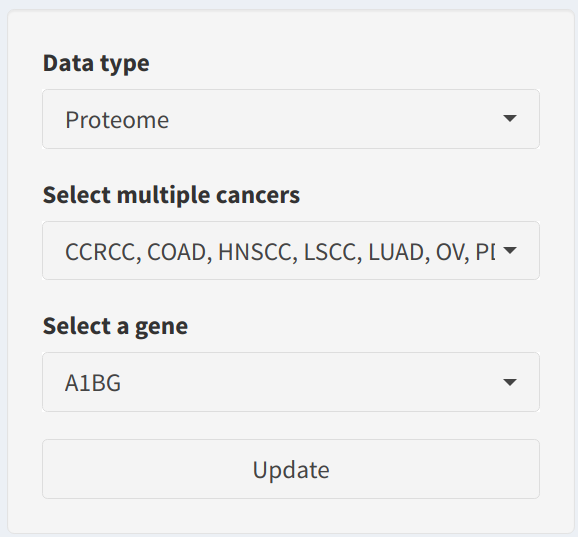
- Data Type: Choose whether to use
ProteomeorPhosphoproteomedata. Selecting the correct data type is crucial for accurately representing the biological process you are interested in analyzing. - Select Multiple Cancers: Select the cancer types to be included in the analysis. It is recommended to select at least two cancer types to enable meaningful cross-comparison. Supported cancer types include CCRCC, COAD, HNSCC, LSCC, LUAD, OV, PDAC, and UCEC.
- Select a Gene: Use the dropdown to specify the gene of interest. The available gene options are dynamically updated based on the selected data type (proteomic or phosphoproteomic data).
- Update Button: Click the Update button to visualize the selected protein or phosphoprotein expression across the specified cancer types. The boxplot will differentiate between Tumor and Normal samples for each cancer type.
2. Main Panel
The main panel provides the following sections for exploring pan-cancer data:
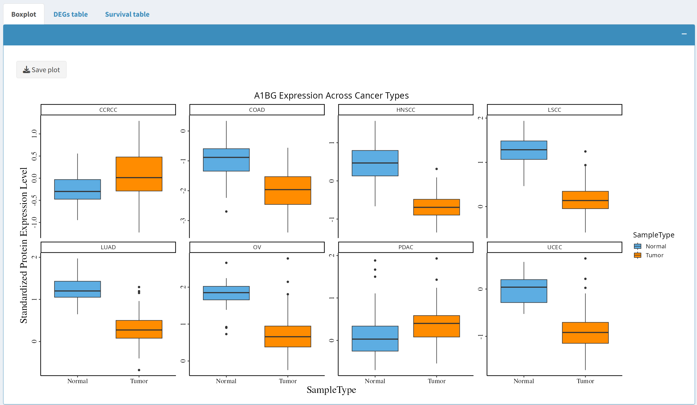
2.1 Boxplot of Protein Expression
The boxplot visualizes the expression of the selected protein across the chosen cancer types. Users can observe differences between tumor and normal samples for each cancer type:
- Click the Update button to generate the boxplot, which presents standardized protein expression levels across selected cancer types.
- Users can download the boxplot in PDF format for further analysis or for inclusion in reports or presentations by clicking the Save Plot button.
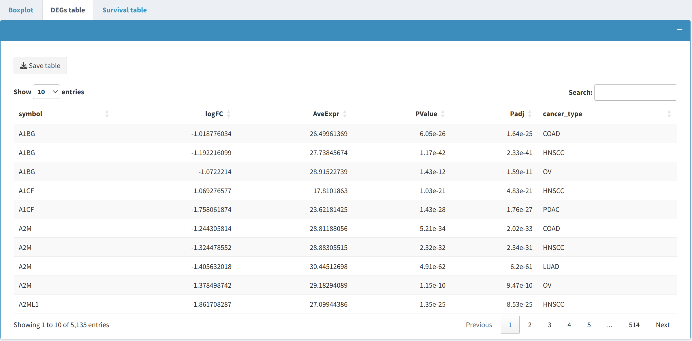
2.2 Differentially expressed proteins (DEPs) and phosphoproteins (DEPPs)
The DEP/DEPP presents proteins or phosphoproteins that are differentially expressed between tumor and normal samples for the selected cancer types:
- The table includes metrics such as fold change and p-values for the proteins that are significantly differentially expressed across the selected cancer types.
- The user can download the table in CSV format for record-keeping or further analysis. This table can also be edited interactively using the editable features provided in the app.
- The Download Table button allows users to save the table to their local system for further investigation.
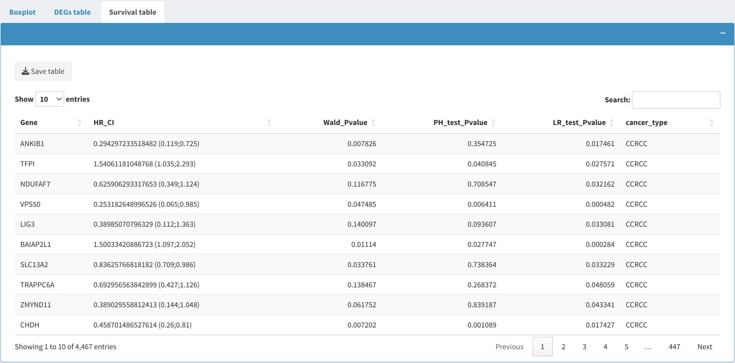
2.3 Survival Data Table
The Survival Data Table provides survival analysis metrics for the selected cancer types:
- This table includes metrics that can be used to evaluate the prognostic impact of different genes on patient survival outcomes.
- The survival data is dynamically filtered based on the user-selected cancer types, allowing for a focused examination of survival metrics in the cancers of interest.
- The table can be downloaded in CSV format using the Download Table button, making it easy to use for downstream survival analyses or reports.
3. Practical Applications and Insights
The Pan-Cancer tab is designed to facilitate several important research objectives:
- Cross-Cancer Comparison: By comparing protein/phosphoprotein expression across multiple cancers, researchers can identify genes that are either commonly dysregulated across cancers or specifically altered in certain cancer types.
- Identifying Biomarkers: Differential expression patterns can be used to identify potential biomarkers that are indicative of the presence of a particular cancer type or that could be used for prognosis and treatment monitoring.
- Survival Association Analysis: By examining survival data, researchers can evaluate whether certain genes are associated with survival outcomes across different cancers, providing insights into the prognostic potential of those genes.
4. Next Steps
After visualizing protein expression and reviewing the DEP/DEPP and survival data, consider the following next steps:
- Further Analysis: Explore specific genes of interest identified in the DEP/DEPP in more detail. This could involve validating their roles in cancer biology through experimental studies or further computational analysis.
- Use with Other Modules: Integrate the genes identified in the Pan-Cancer tab with other modules like the Survival Analysis tab to determine their potential prognostic impact or with the Machine Learning tab to use them as predictive features for cancer classification.
- Validation Studies: Consider validating the findings from the pan-cancer analysis with experimental data to confirm the identified biomarkers' biological relevance across multiple cancer types.
Introduction
The Machine Learning tab in OncoProExp provides users with powerful tools to predict cancer types based on proteomic and phosphoproteomic datasets. Users can choose from a range of classifiers to create predictive models and evaluate their performance with various metrics, such as accuracy, precision, sensitivity, F1-score, specificity, and AUC. The models included are Support Vector Machines (SVM), Random Forests (RF), and Artificial Neural Networks (ANN), leveraging TensorFlow and other robust machine learning libraries.
1. Sidebar Panel
In the sidebar, users configure key parameters for building the machine learning models:
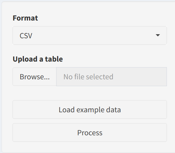
- Format: Select the file format of the uploaded data—
CSVorTSV. This ensures the data is read correctly. - Upload a Table: Users can upload a custom dataset, which must contain gene or feature IDs in the first column and sample data in the remaining columns. The uploaded dataset will be used as input for predictive modeling.
- Load CPTAC data: For convenience, users can Load CPTAC data to experiment with the app without uploading their own data.
- Process Button: After loading or uploading the data, users can click the Process button to prepare it for modeling.
2. Model Building Parameters
After processing the dataset, users can set the parameters for training a machine learning model:
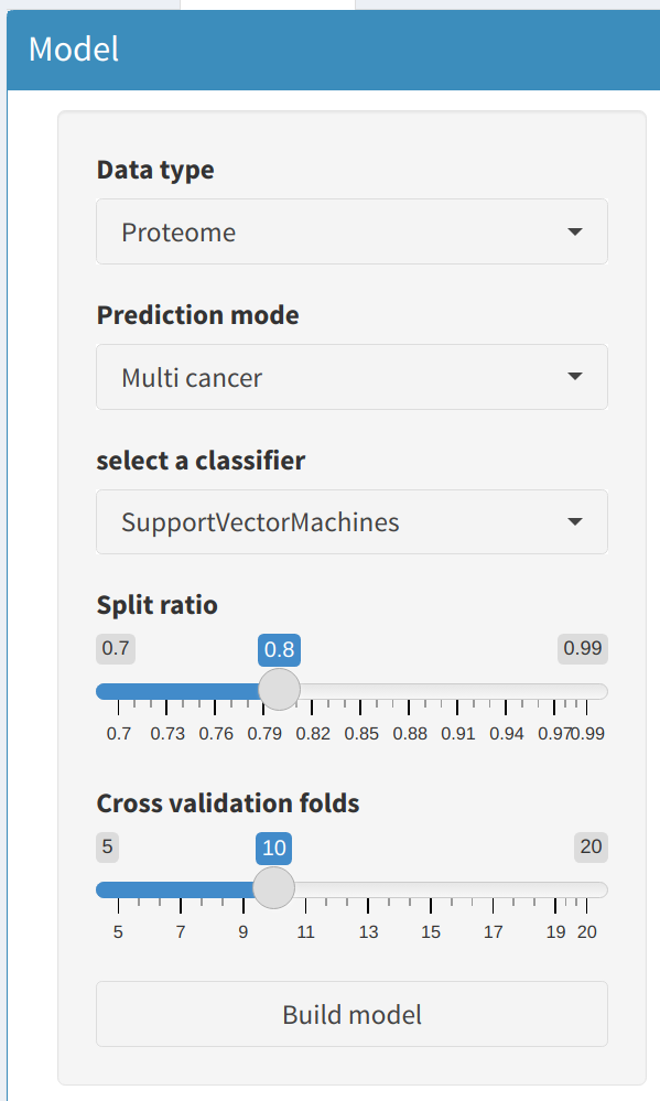
2.1 Data Type and Prediction Mode
- Data Type: Select whether the analysis will use Proteome or Phosphoproteome data. This choice will determine the type of molecular features used for building models.
- Prediction Mode: Choose between Single Cancer or Multi Cancer modes:
- Single Cancer: Train a model to differentiate between tumor and normal samples for a single cancer type. The cancer type can be selected from a dropdown menu that includes various options such as Clear Cell Renal Cell Carcinoma, Colon Adenocarcinoma, and more.
- Multi Cancer: Train a model that can predict multiple cancer types simultaneously. This mode is useful for cross-cancer prediction and broader biomarker identification.
2.2 Classifier Selection and Specific Parameters
Select a machine learning classifier to train the model:
- Support Vector Machines (SVM): A linear or non-linear classifier that separates data points using hyperplanes.
- Random Forest (RF): A tree-based model that builds multiple decision trees and combines their results for prediction.
- Specify the Number of Trees (ntree) to control the complexity of the Random Forest.
- Artificial Neural Network (ANN): A deep learning model that uses multiple layers to extract complex patterns.
- Define the number of Epochs for training. More epochs generally improve model accuracy but may lead to overfitting.
2.3 Model Hyperparameters
Users can fine-tune the model with additional hyperparameters:
- Split Ratio: Specify the ratio for splitting data into training and testing sets. A higher ratio leaves more data for training, while a lower ratio reserves more data for testing.
- Cross Validation Folds: Set the number of folds for cross-validation. This technique ensures robust performance evaluation by partitioning the dataset into multiple segments.
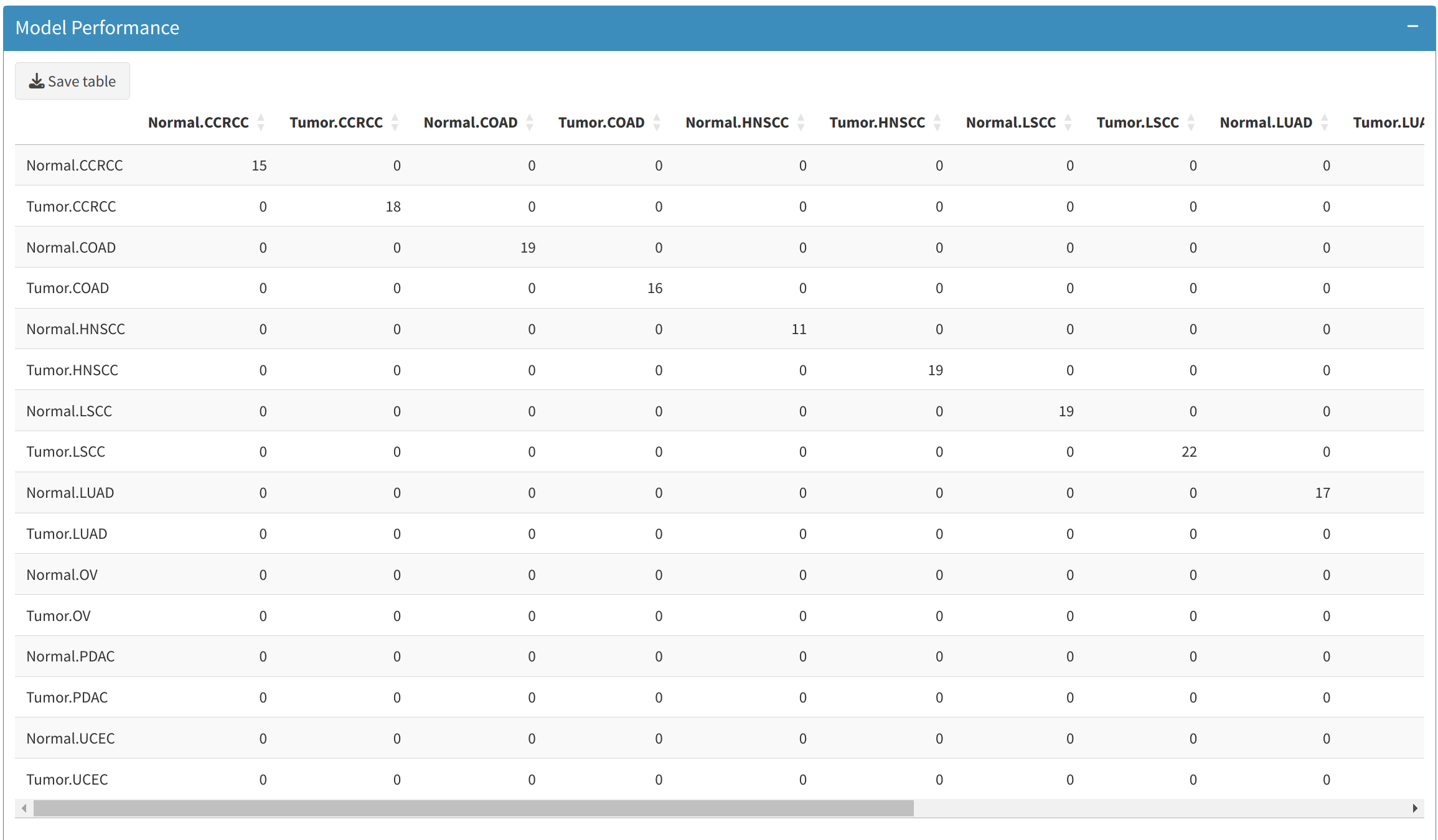
3. Model Performance and Predictions
After training a model, users can explore model performance metrics and generate predictions:
3.1 Confusion Matrix
The Confusion Matrix tab provides a breakdown of how well the model classifies each sample. Users can:
- View metrics such as True Positives (TP), False Positives (FP), True Negatives (TN), and False Negatives (FN).
- Download the confusion matrix for further analysis by clicking the Save Table button, which will provide a CSV file of the matrix.
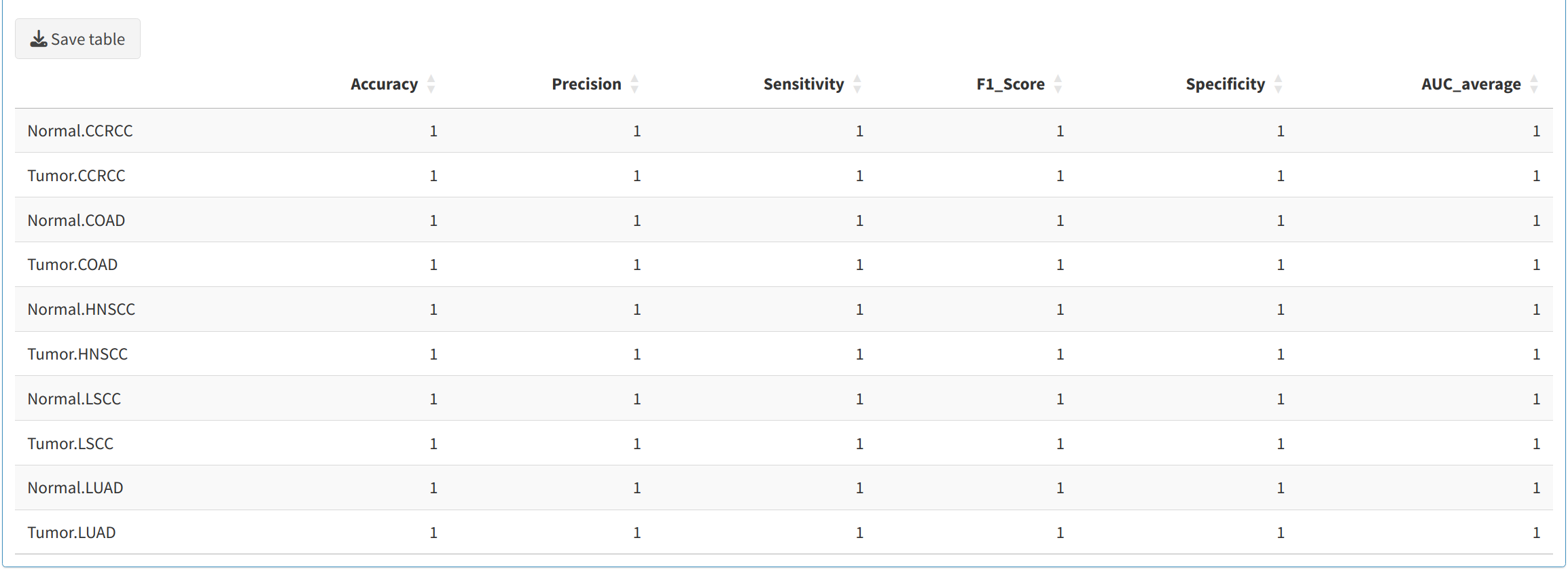
3.2 Model Performance Metrics
Users can evaluate the trained model's performance using various metrics, including:
- Accuracy: Overall correctness of the model.
- Sensitivity (Recall): The ability of the model to correctly identify positive samples.
- Specificity: The ability to correctly identify negative samples.
- Precision: Proportion of predicted positives that are true positives.
- F1-Score: Harmonic mean of precision and sensitivity.
- Area Under Curve (AUC): A measure of model's capability to distinguish between classes.
These metrics are generated for each fold of cross-validation and are downloadable in CSV format for record-keeping.
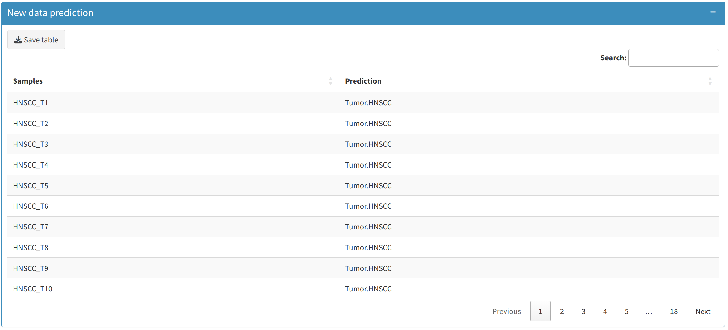
3.3 Predictions on New Data
Users can make predictions on new datasets using the trained model:
- Upload a new dataset for prediction. This dataset should have the same format as the training dataset (gene or feature IDs in the first column).
- Once the model is trained, the New Data Prediction section allows users to view the predicted class for each sample in the uploaded data.
- Users can download these predictions as a CSV file, making it easy to integrate into further analyses or share with collaborators.
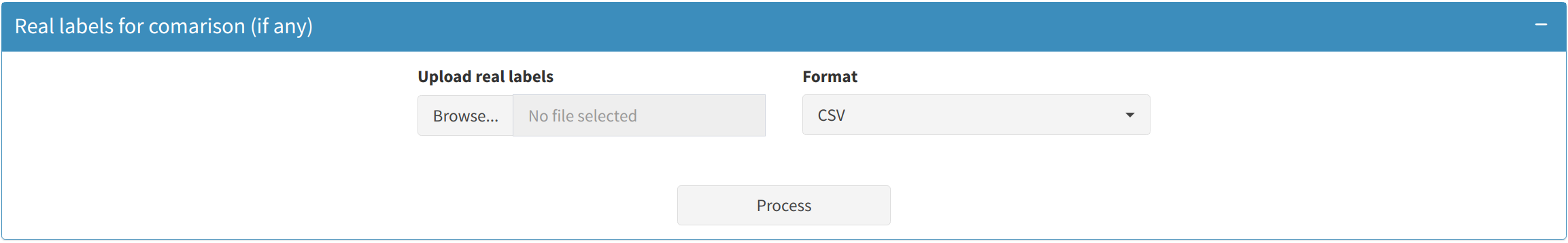
3.4 Comparing Predicted and Real Labels
If users have actual class labels for the new data, they can upload these to compare with the model's predictions:
- Upload a file containing the real labels (in CSV or TSV format).
- The app will calculate a Confusion Matrix and other performance metrics for the real labels versus the model's predictions.
- Download the comparison results for further inspection or presentation purposes.
4. Backend Workflow and Data Handling
Here is an overview of how the backend handles data during machine learning:
- Loading Data: The app loads either the proteomic or phosphoproteomic dataset based on user selection. When Single Cancer mode is selected, the app further filters the data to include only tumor and normal samples for the selected cancer type.
- Updating UI Elements: Dynamic elements such as dropdowns for cancer types, data types, and classifier options are updated based on user inputs, making the UI intuitive and responsive to user actions.
- Model Building: The app uses the selected machine learning algorithm to build a predictive model. The parameters provided in the sidebar, like the number of epochs for ANN or the number of trees for RF, determine the training process. Model evaluation metrics are calculated based on either cross-validation or held-out test sets.
- Downloading Results: Users can download model outputs, such as confusion matrices and performance metrics, as CSV files. These outputs are generated by the backend and are useful for record-keeping and analysis.
5. Practical Applications and Insights
There are numerous applications for the outputs from the Machine Learning tab:
- Biomarker Discovery: Use predictive models to identify proteins or phosphoprotein that are highly indicative of specific cancer types.
- Early Diagnosis: The models can be used to predict the likelihood of cancer in new samples, potentially helping in early detection and diagnosis.
- Model Comparison: Users can train multiple models with different classifiers and compare their performances using metrics such as accuracy, sensitivity, and AUC, helping to identify the best-performing model for a given dataset.
Next Steps
After building machine learning models, consider the following next steps:
- Further Model Tuning: Experiment with different hyperparameters (e.g., number of epochs, number of trees, or split ratio) to optimize model performance.
- Feature Selection: Identify the most important features from the trained models (e.g., top-ranking proteins) and investigate their biological relevance.
- Collaborative Research: Share the model predictions and performance metrics with collaborators or use the findings to guide wet lab validation experiments.
- Integration with Other Modules: Incorporate the findings into other tabs, such as Survival Analysis, to explore the prognostic impact of predictive features.
Introduction
The Survival tab in OncoProExp provides comprehensive tools for survival analysis, enabling users to explore the prognostic impact of specific biomarkers across various cancer types. Users can conduct univariate or multivariate survival analyses, visualize Kaplan-Meier (KM) plots, generate survival tables, and create violin/box plots for selected covariates.
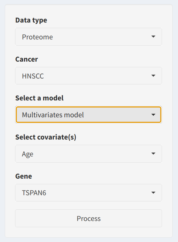
1. Sidebar Panel
In the sidebar, users can configure the survival analysis parameters:
- Data Type: Choose between Proteome or Phosphoproteome datasets to define the source data for the analysis.
- Cancer Type: Select from available cancer types (e.g., HNSCC, LUAD, etc.). This determines the dataset used for analysis, and it updates dynamically based on user input.
- Model Selection: Choose between a Univariate model or a Multivariate model. Multivariate models enable users to include additional covariates for more detailed analysis.
- Covariates Selection: If the multivariate model is selected, users can specify additional covariates to adjust the model. The covariate choices are automatically populated based on the clinical data.
- Gene Selection: Select a gene or feature from the dataset to perform survival analysis. This dropdown is dynamically updated based on the uploaded dataset.
- Process Button: Click the Process button to initiate the survival analysis workflow.
2. Main Analysis Features
Once the parameters are set in the sidebar and the analysis is initiated, the following features are available:
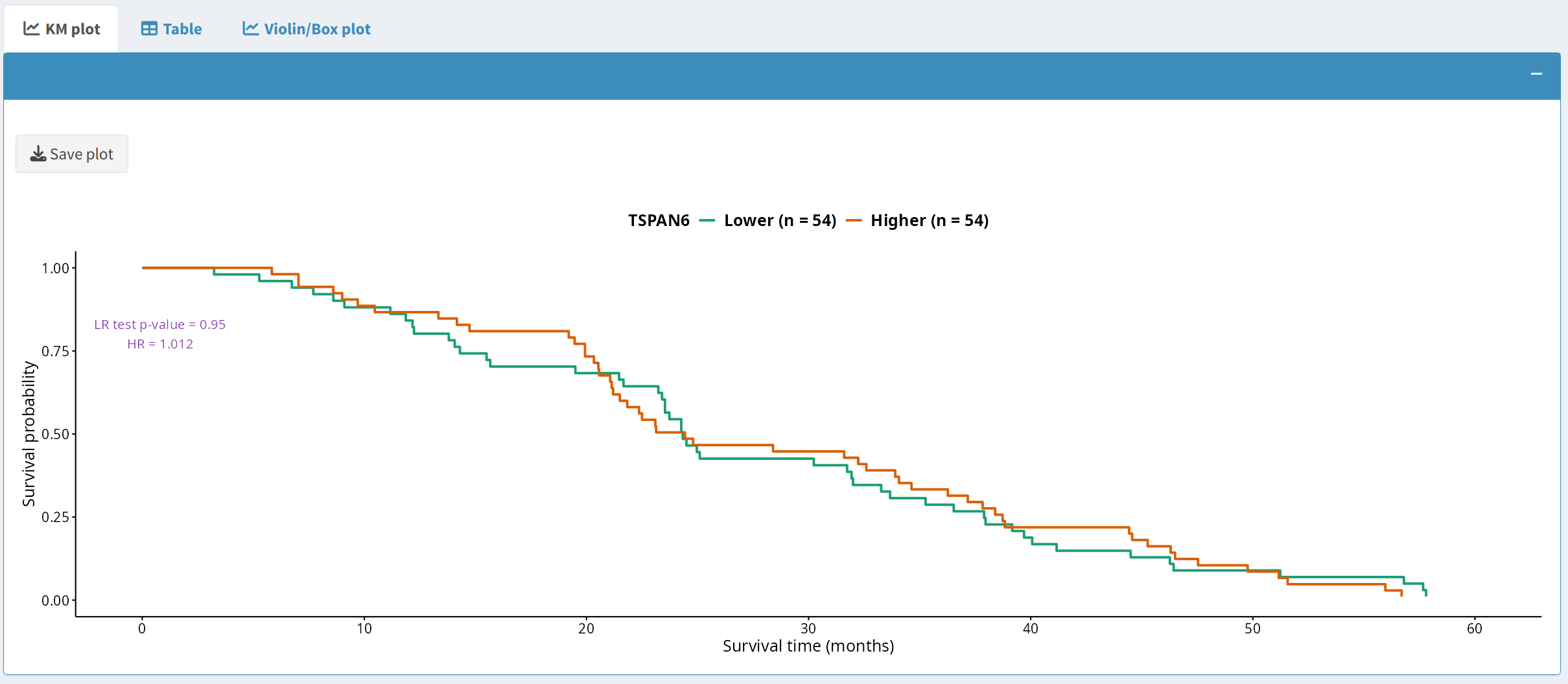
2.1 Kaplan-Meier Plot
The Kaplan-Meier (KM) plot visualizes survival differences between groups based on a specific protein or phosphoprotein expression threshold. Users can:
- Visualize survival outcomes based on user-defined split criteria, such as the median.
- Download the plot in PDF format by clicking the Save plot button, which uses a dynamically generated filename that includes the timestamp, cancer type, and data type.
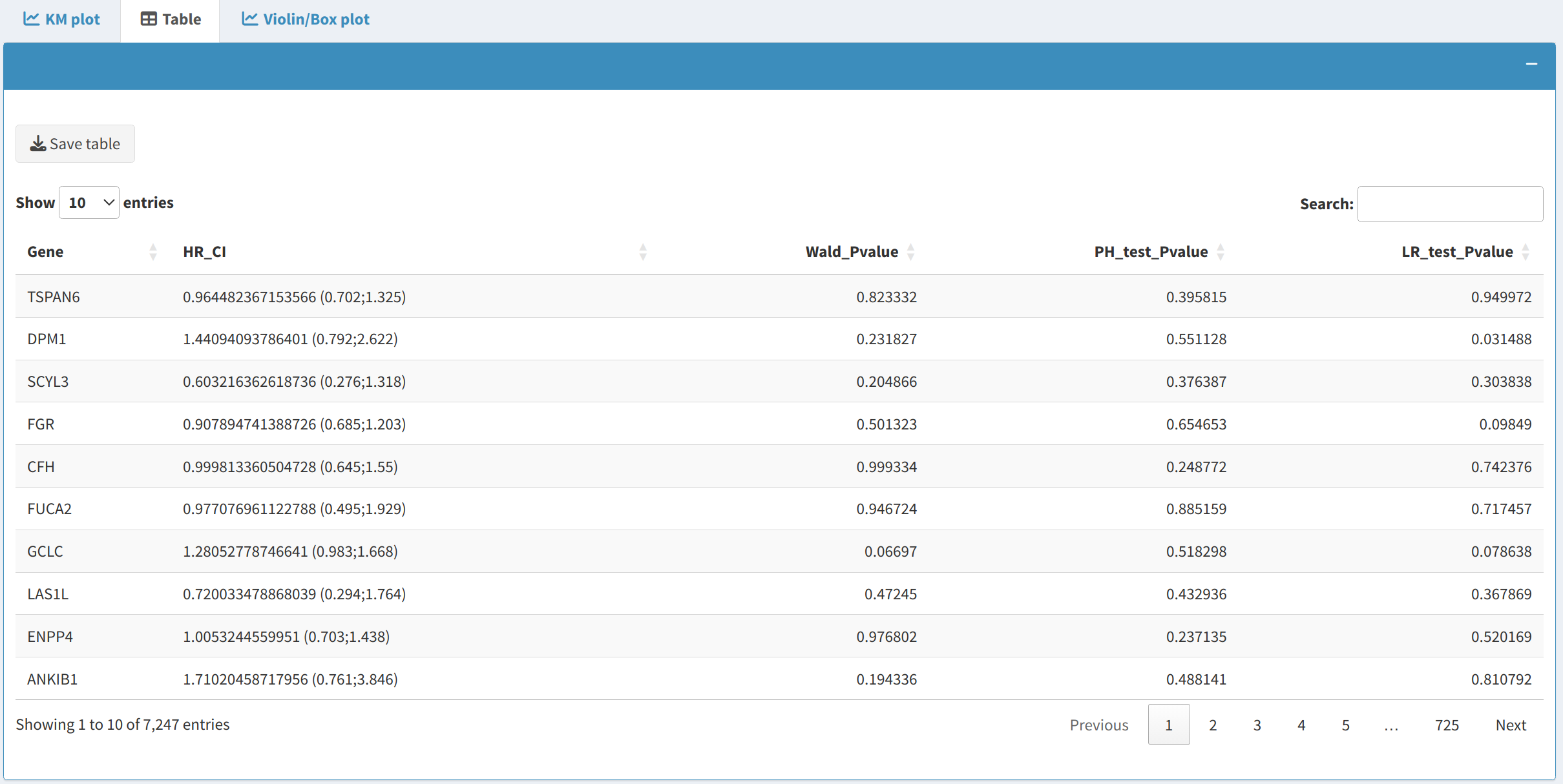
2.2 Survival Table
The Survival Table provides detailed results from Cox proportional hazards models:
- It includes metrics such as Hazard Ratios (HR), Confidence Intervals (CI), and p-values.
- Users can download the table in CSV format, making it easier to analyze survival data further or include it in reports.
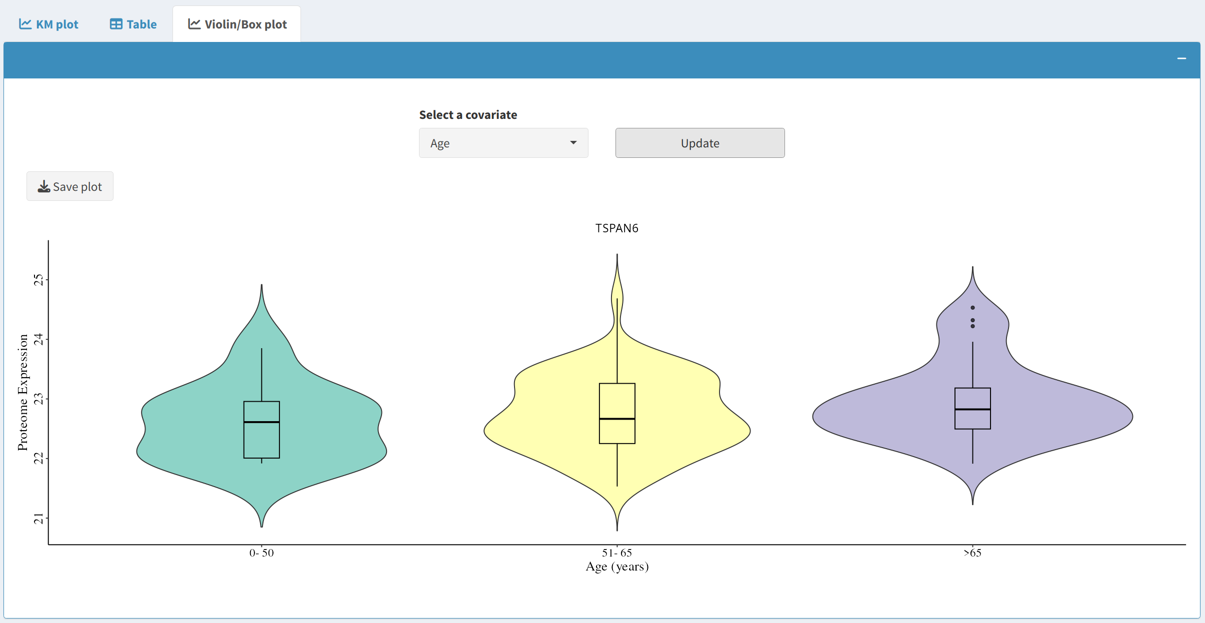
2.3 Violin/Box Plot
The Violin/Box Plot tab allows users to explore relationships between covariates and the selected gene:
- Select a covariate to see how its expression relates to the survival outcomes of specific biomarkers.
- The violin plot combines aspects of both box plots and density plots, providing a detailed view of data distribution.
- Users can also download the plot as a PDF for further analysis or publication purposes.
3. Practical Applications and Insights
The Survival tab in OncoProExp has numerous practical applications:
- Biomarker Discovery: Identify genes that significantly impact survival across different cancers, which can be used for identifying potential biomarkers.
- Risk Assessment: Use multivariate models to include multiple covariates, which can help in understanding how combinations of variables influence survival risk.
- Publication-Ready Figures: Generate KM plots and survival tables that can be downloaded and included in research manuscripts or presentations.
- Exploratory Data Analysis: The violin and box plots help visualize the distribution and relationships between variables, providing deeper insights into the data structure.
Next Steps
After performing survival analysis, here are some potential next steps:
- Data Integration: Integrate survival results with other layers of data such as expression or mutation data to gain a more comprehensive understanding of cancer progression.
- Collaborative Research: Use the survival plots and tables to facilitate discussions with clinical researchers or collaborators who are interested in cancer prognostics.
- Report Generation: Download the generated survival plots and tables to include in reports, manuscripts, or other scientific documentation for evidence-based conclusions.
Introduction
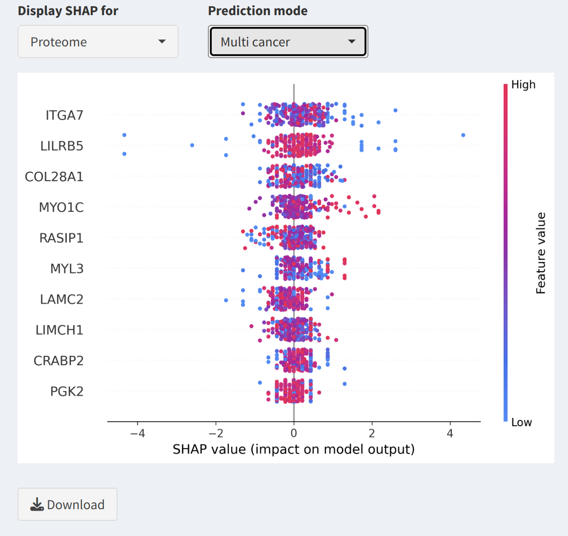
The Download tab allows users to retrieve expression and metadata files for both proteome and phosphoproteome data across multiple cancer types. Additionally, users can download SHAP (SHapley Additive exPlanations) visualizations for both multi-cancer and single-cancer modes, enabling interpretation of feature contributions in predictive models.
1. Overview
The tab is divided into two sections:
- Column 1: Cancer Data Downloads - Facilitates the download of expression and metadata files for various cancer types.
- Column 2: SHAP Analysis Downloads - Allows users to preview and download SHAP visualizations in both multi-cancer and single-cancer modes, with the option to focus on specific cancer types.
2. Cancer Data Downloads
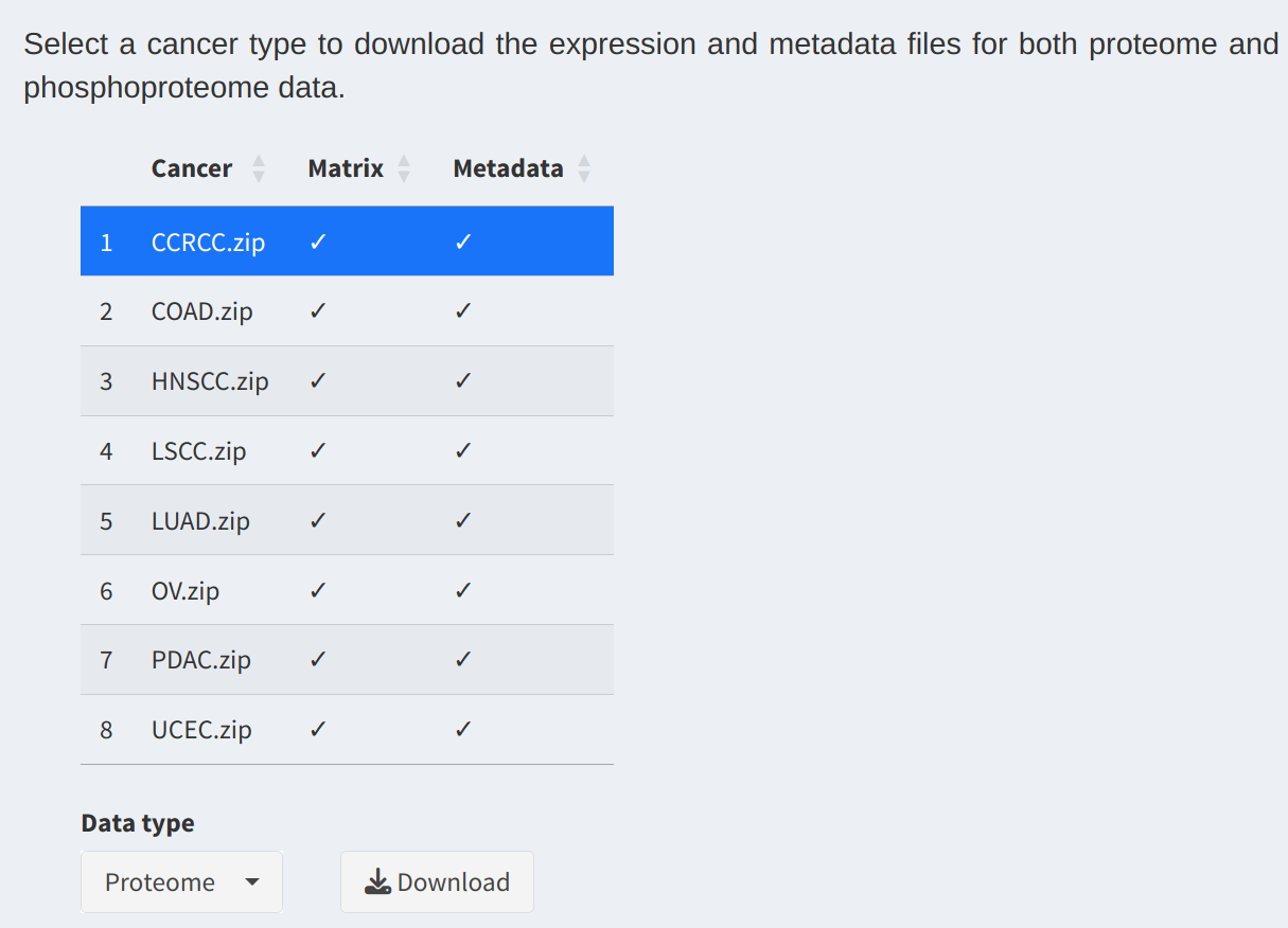
In this section, users can access expression and metadata files for different cancer types:
- Data Selection Table:
Displays available cancer types and their respective data files. Users can select a row to specify the desired cancer type for download.
- Select Data Type:
Choose between Proteome and Phosphoproteome datasets using the dropdown menu. The selected data type determines the content of the downloadable zip file.
- Download Files:
Click the
Downloadbutton to download a zip archive containing the selected cancer type's expression and metadata files.
3. SHAP Analysis Downloads
This section enables users to download SHAP visualizations for both multi-cancer and single-cancer modes:
- Select Data Type:
Use the Display SHAP for dropdown to choose between Proteome and Phosphoproteome data.
- Prediction Mode:
Select Multi-cancer mode to view SHAP visualizations that summarize feature contributions across all cancers. Alternatively, choose Single-cancer mode to focus on a specific cancer type.
- Select Specific Cancer:
For single-cancer mode, use the Select a cancer dropdown to specify the desired cancer type. A SHAP visualization will be appeared for the selected cancer.
- SHAP Visualization Preview:
A preview of the SHAP visualization is displayed, showing the contribution of individual features (proteins or phosphoproteins) to the model's predictions.
- Download SHAP Visualizations:
Click the
Downloadbutton to save the SHAP visualization for the selected cancer type or mode. Filenames include timestamps for easy organization.
4. Practical Applications
Here are some ways to use the downloaded data and SHAP visualizations:
- Data Analysis: Use the expression and metadata files for machine learning, statistical analysis, or integrating additional data layers.
- Model Interpretation: SHAP visualizations provide insights into feature contributions, aiding in the interpretation of model predictions for specific cancer types or multi-cancer analyses.
- Collaboration: Share the datasets and SHAP visualizations with collaborators or use them in publications to support findings.
5. Next Steps
After downloading the data and SHAP visualizations, consider the following:
- In-depth Analysis: Analyze protein or phosphoprotein behavior using statistical and bioinformatics tools.
- Presentation: Use SHAP visualizations to present findings on feature importance across cancers.
- Collaboration: Share datasets and insights with other researchers to expand the scope of your analysis.
6. GitLab Repository
Access all relevant code and data through our GitLab page: OncoProExp GitLab Repository.